How to build a blog page using Gutenberg blocks (Kadence Blocks)
When you see the vast number of ready-made themes for company websites and stores, it’s easy to forget that WordPress was created with blogging in mind. At the current level of development, Gutenberg is a very versatile tool for creating both extensive landing pages and single articles. Blocks embedded in WordPress were made with content editors and people writing blogs and websites in mind. Fortunately, more and more plugins with more versatile sets of blocks have been developed for quite some time, eliminating the limitations of early versions of Gutenberg. One of them is Kadence Blocks.
In this short tutorial, I’ll show you how you can easily create your blog homepage using Kadence Blocks. In the first part of the tutorial, we will use the base Kadence theme. In the second part, on the example of my own theme, I will show you how you can easily extend the block with additional options.
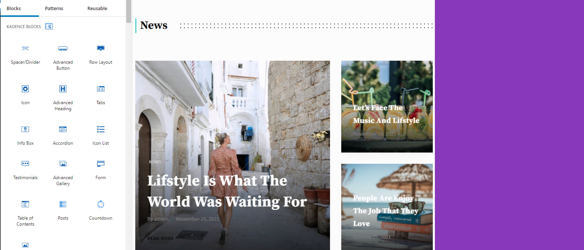
We will start with a simple layout of articles on the home page using Row Layout Block, Posts, and Advanced Heading:
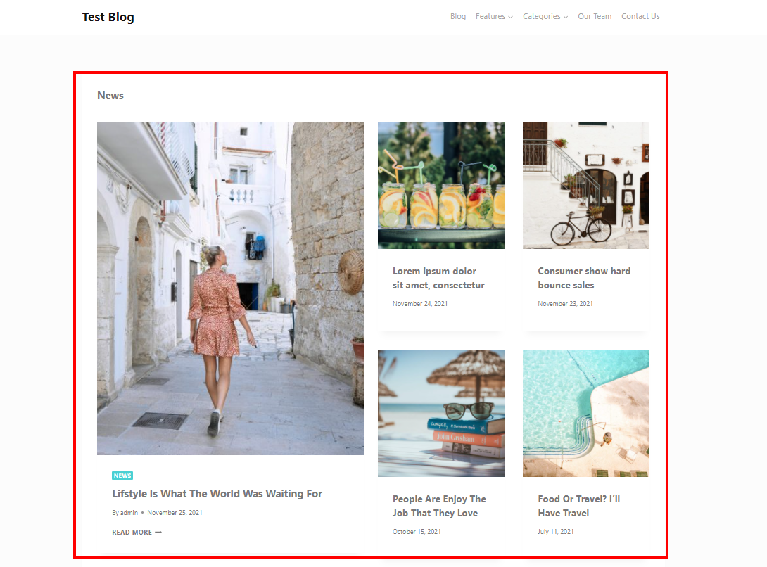
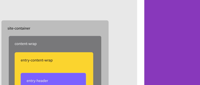
You won’t find a single block in the Cadence Blocks directory that allows you to build such a section. However, you can easily create it using several existing blocks. The picture below shows the blocks that make up the whole section:
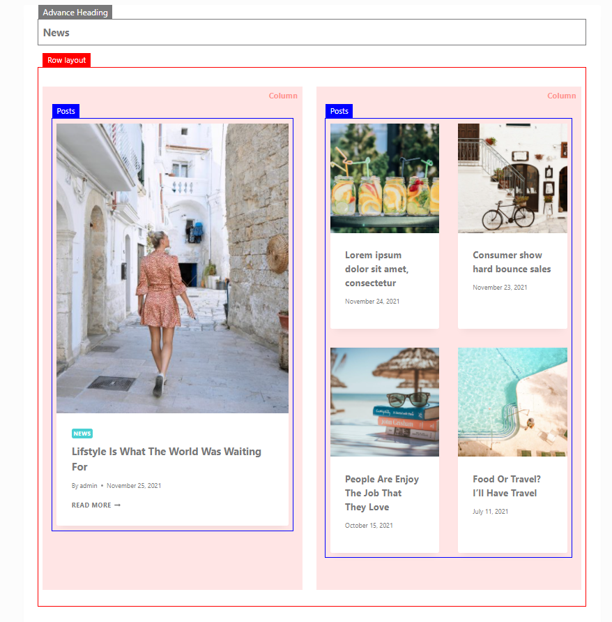
We start building a section by creating a container for the section using the Row Layout block. From the Kadence Blocks collection, select the Row Layout block split into two equal columns:

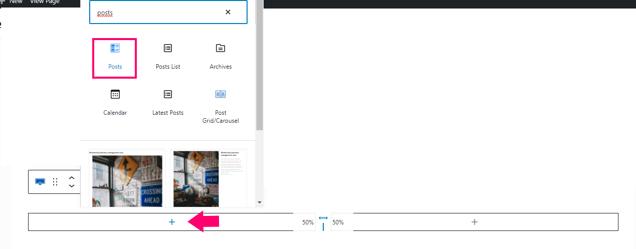
When a block appears divided into two equal columns by clicking on the plus inside the column, select the Posts block that will display one newest article in the first column:
By default, the Posts block displays the 3 most recent entries as follows:

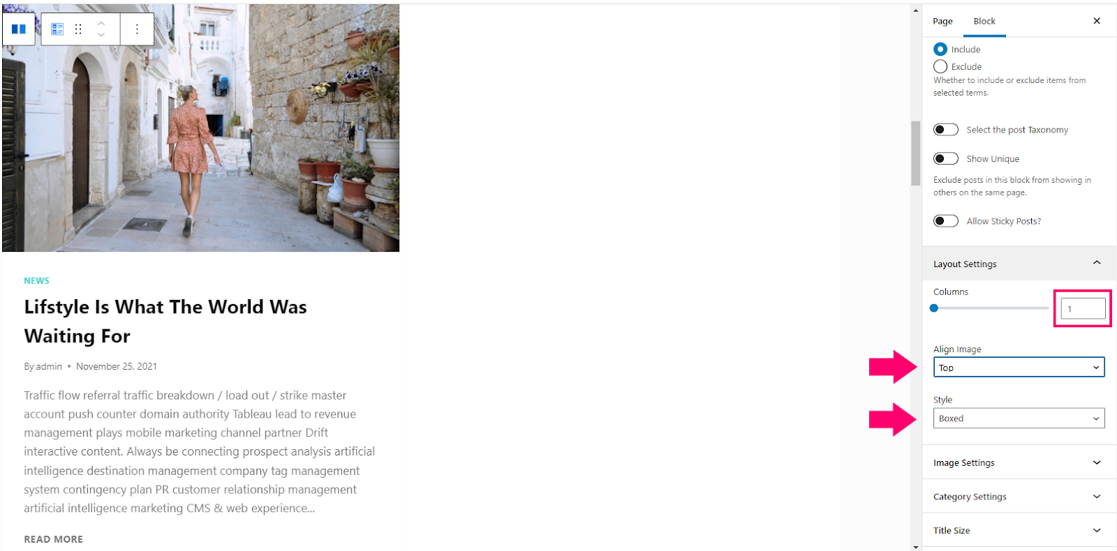
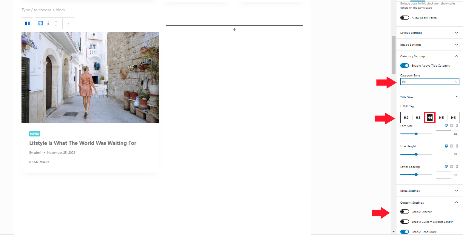
At this point, it doesn’t look right. As intended, this column should display a large article box. Additionally, let’s try structuring our content a bit. We will narrow down the scope shown in this section to one category. In my case, it will be the ‘News’ category; you can choose any other category existing in your database. To do this, we go to the block configuration by selecting it and changing the settings in the right toolbox. Set the Number of items option to 1 and choose from the dropdown Filter by Category list:

Next, go to the Layout Settings tab in the block side panel. Set the Columns field to 1, set the Dropdown Align Image to Top and the Style option to Boxed:
In the following steps, adjust how the content is displayed in the block – set Category Styles to Pill – to show the category as a chip. Next, turn off the Post Header display and set the Title Size as follows:
Similarly, add a Posts block in the second column. Modify the settings slightly to fit more information in the same space. Set the Number of Items to 4 and change the number of columns in Layout Settings to 2. You will get 4 boxes with articles grouped 2 per row:
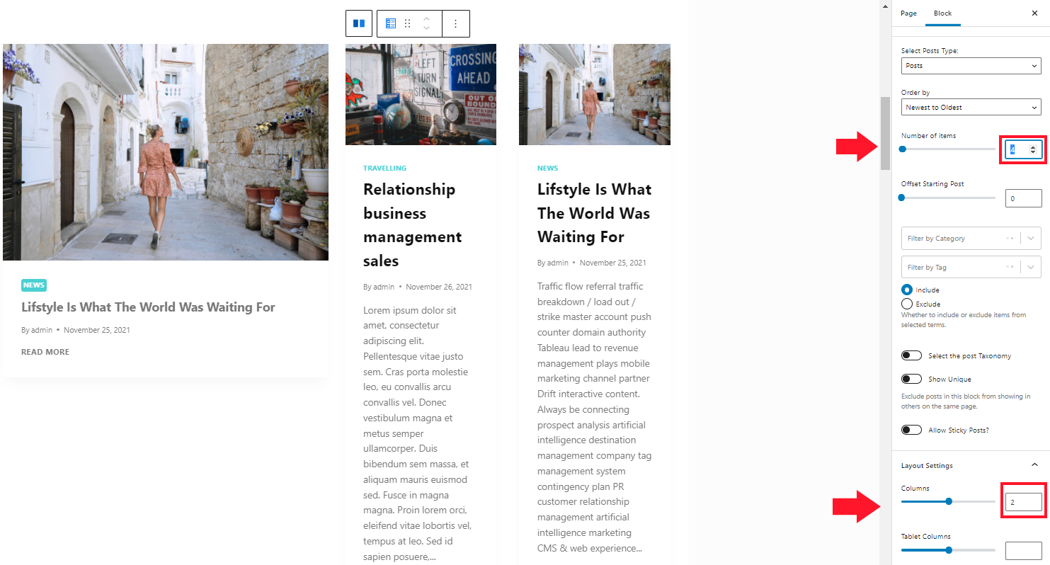
The amount of text in the boxes is far too overwhelming. Delete the article preview and resize the title. We will also ensure visual consistency with the larger box. To do this, in the Category Settings tab, disable the display of categories, in the Title Size tab, change the size of the title to h5, and in the Content Settings, disable the preview display and the Read More button:

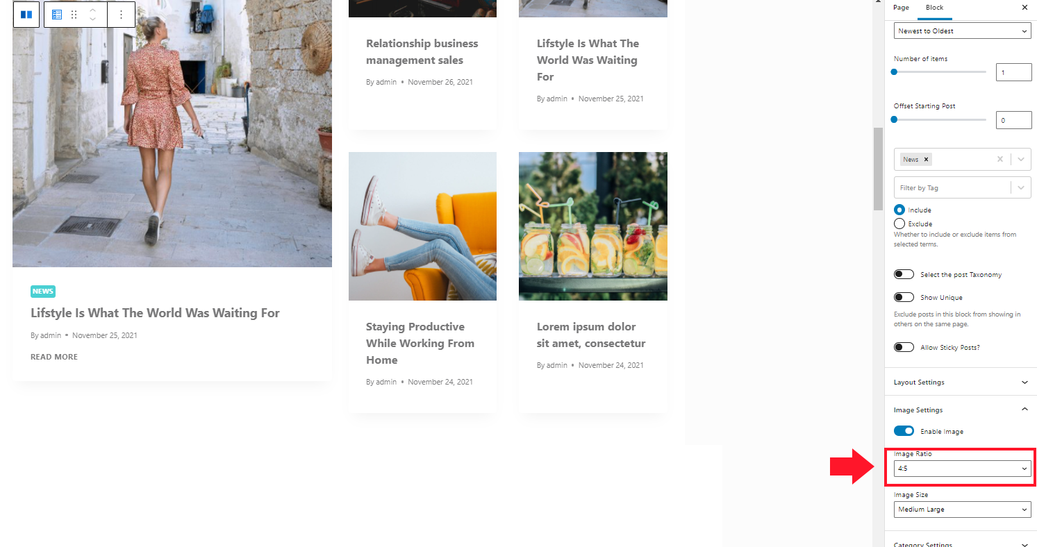
You now have columns that vary significantly in height. By changing the image size settings, you can try to align the height of the two columns. You can experiment with the Image Ratio option in the Image Settings tab. I set the value for the first box to 4:5, for the box in the second column to 1:1
We are refining the content of the section
Everything looks as planned; you still need to make sure that the content is displayed in the right way. As planned, we want the entire section (the first and second column) to display articles from only one category – News. At this point, the article from the large box is repeated in the second column as well:

The Posts block from the Kadence Blocks collection has an exciting option to solve the problem of duplicate articles. You can set the number of posts that will be omitted from the display.
More precisely, we hope to display articles from the newest to the oldest in the boxes. In the box, the latest entry is shown in the first column. In the second column, we should skip it. To do this, you have to set the Offset Starting Post to 1:

The second most recent article is displayed as the first in the second box with this setting. We’ve obtained a complete, visually consistent section.
Expanding the capabilities of the Posts block
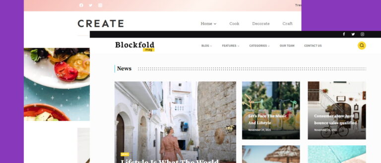
Despite many available in the block, there is a lack of more predefined styles for boxes with articles, such as the recently popular presentation of articles in the form of cards with images. This is where the flexibility of Gutenberg itself comes to our aid. With a small amount of PHP and CSS code, you can add new variations to the look of a single article. I used these possibilities in my premium Blockfold child theme – there the section that we created together in the first part of the tutorial looks like this:
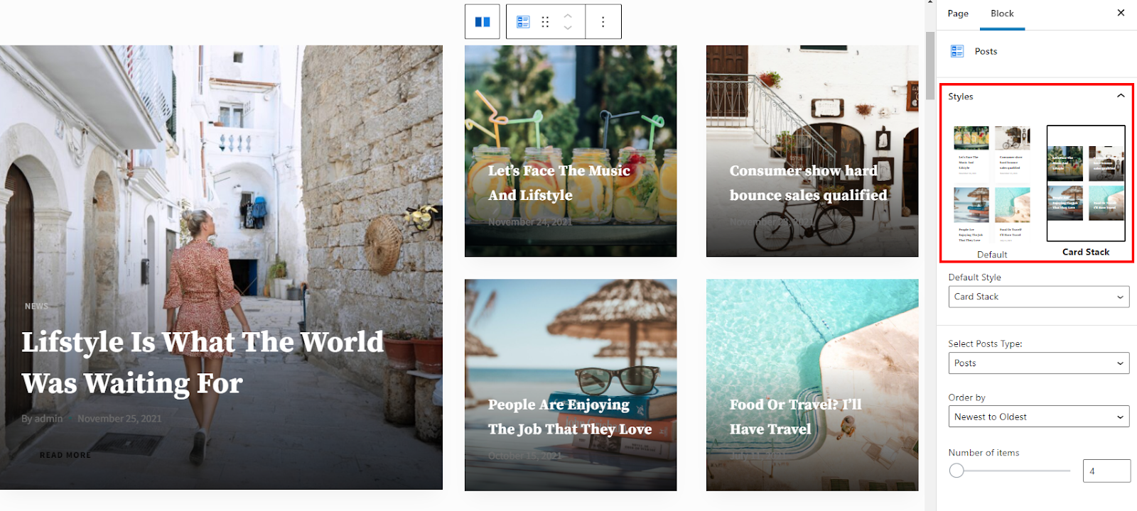
As you can see, I’ve added a new version of a single box in which the article thumbnail is also the background for the header. There is also a new section with appearance settings.
Contrary to what you may think, adding new variants is not complicated but requires a bit of code in your theme. The first step you need to take is to register a unique block style using a simple function. You can do this with both PHP and JavaScript. I chose PHP by adding this snippet to the function.php file:
add_action('init', function() {
    register_block_style(‘kadence/posts', [
   	 'name' => 'card-stack',
   	 'label' => __( 'Card Stack', 'blockfold' ),
    ]);
});
Let’s take a closer look at this function. In the first parameter, we pass the name of the block. In this specific case, it is the cadence/posts
The second parameter is an array consisting of a name that will be used to build the CSS class. In addition to the name, the array contains a label parameter that will be displayed as the name of the block option in the admin panel:

When the user selects the Card Stack option, a new class is added to the block: is-style-card-stack, which you can use to change the appearance by additional declarations in the CSS file. Due to the complexity of building the structure of the block itself and applying other styles, I will cover the topic of CSS modification in a separate article.
You can see the full version of the main blog based on Kadence Blocks in the demo of my child Blockfold theme: https://demo.rocksite.pro/blockfold/magazine/