Page layout and Post variations in Kadence Theme – overview
Kadence theme has a lot of options to customize the appearance of pages and posts. We can easily define content layout in articles on our blog or website. There are two groups of settings:
- Global – the settings can be found in Customizer.
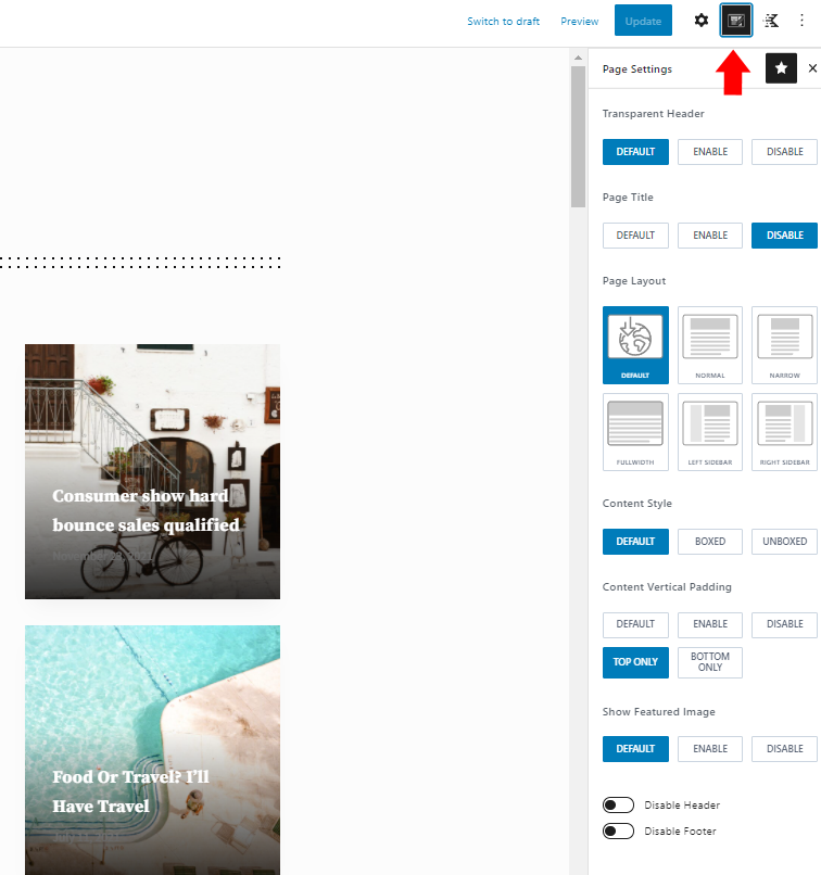
- Local – Regardless of global settings, you can customize the content display for each page or post individually. Options can be found in the dedicated editor panel:
During the development of my child theme, I found that the number of possible combinations can be overwhelming. Especially issues related to content style settings, Featured Image layout, page header, and mutual implications resulting from these settings are not always obvious.
In this article, I will try to briefly describe how these combinations of settings affect the website’s structure and how you can use them to set the optimal layout for your needs. Suppose you want to create your own child theme for Kadence Theme or are a designer creating a project dedicated to Kadence Theme. In that case, this information can also be beneficial.
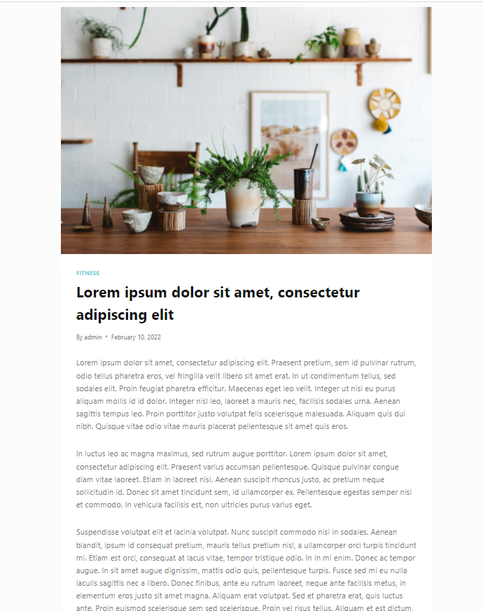
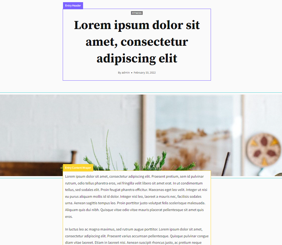
In the examples, I will use my child theme Blockfold. To simplify the analysis, I will limit the layout width setting to narrow. The default post/page content layout immediately after installing the theme looks like this:
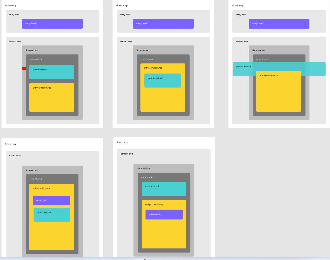
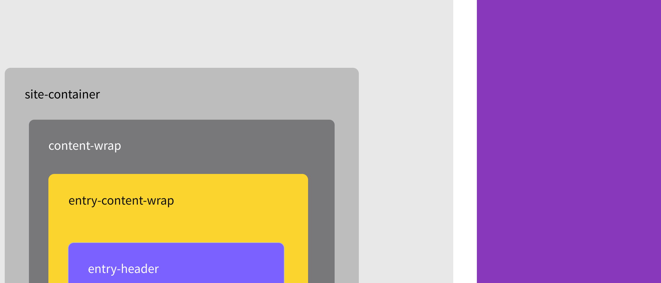
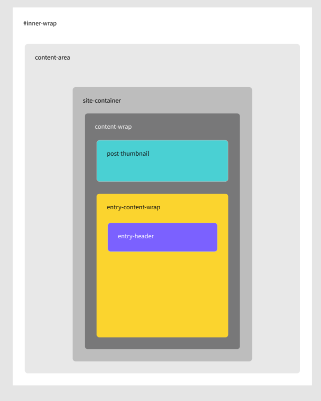
In order to clarify our consideration about the individual components of this layout on the screenshot below, I have presented a sectional breakdown following the convention adopted in the HTML code of the theme:
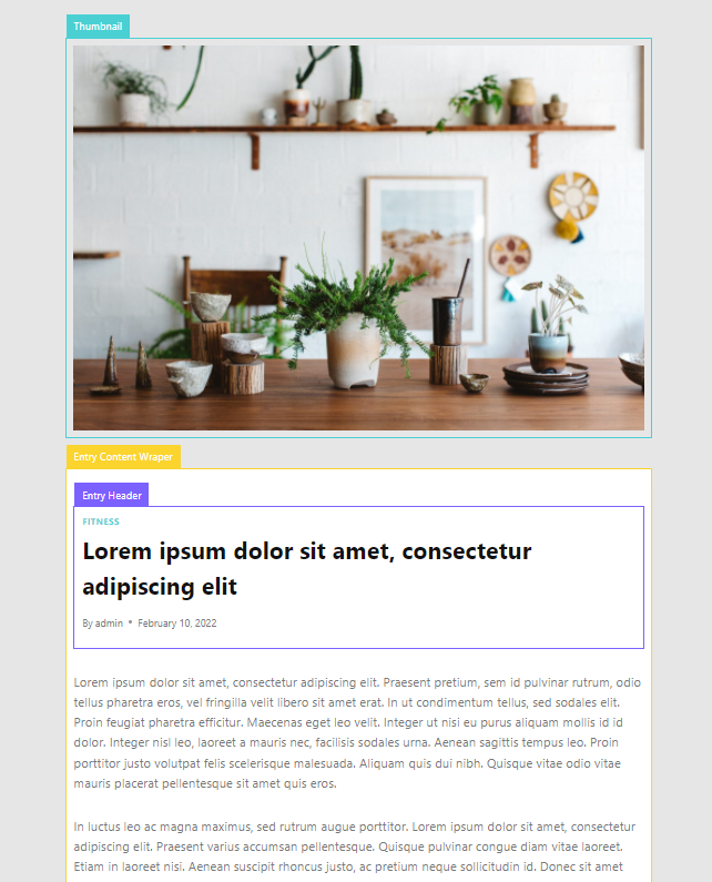
The essential options are responsible for content layout.
The default settings for the options responsible for the above layout look as follows:
Content Style: Boxed
Featured Image Position: Above
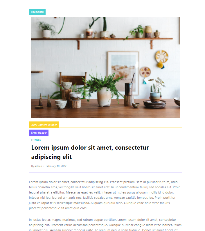
Post Title Layout: In Content
The first of these options is responsible for the style of the content container. The boxed value means packing the entire content in a container with a padding and background – the yellow Entry Content Wrapper area on the screen. In Customizer, you can define a contrasting background for this area in the larger or smaller side with the whole page background.
Featured Image Position defines the position of the featured image relative to the content and header. As the name suggests, the Above value indicates the position above the content.
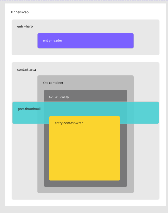
The Post Title Layout option indicates the location of the Entry Header section in the Entry Content Wrapper area. I’ve shown this more schematically in the graphic below, including the primary containers on the page (based on the HTML structure and the names of the main container classes):
Knowledge of this structure may be most useful when creating your CSS code in a Kadence child theme. It also helps to understand how our layout will behave on mobile devices. The Site Container has, for example, the global content edge padding property, which defines the area between the content and the browser window on mobile devices:
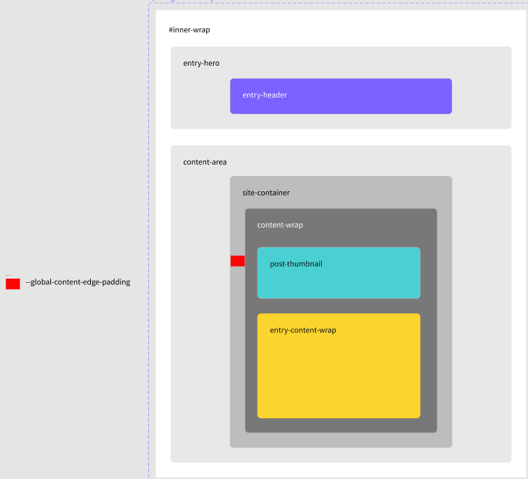
I marked the complement mentioned above in red.
Layout variants for articles
I have shown 3 basic options defining the layout of the article’s content. I have demonstrated the layout by default after installing the theme. Now let’s go through the different variations of these settings together and how they affect the appearance of the content.
Let’s change the Content Style option to Unboxed and see the effect on appearance:
The Unboxed setting removes a clearly outlined container with content, and the entire area of the page has a background defined in the Content Background option (Customizing -> General -> Colors)
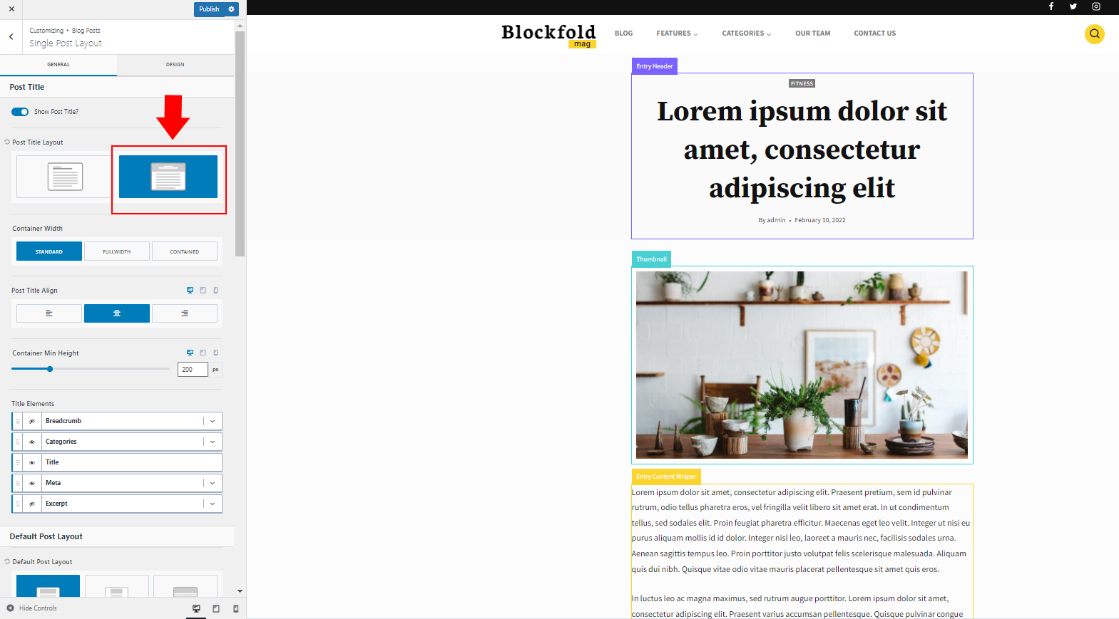
Now let’s see how the section layout will be affected by changing the Post Title Layout option from In Content to Above Content. This option can only be changed globally in Customizer (Customizing -> Blog Posts -> Single Post Layout)
This option strongly emphasizes the title of the article.
If you want to offset the dominance of the title by increasing the article image, try the following set of settings:
Content Style: Boxed
Featured Image Position: Behind
Post Title Layout: Above Content
This is a good option if the image representing is only an add-on and proper cropping is not crucial for the content message. The disadvantage of this solution is that the composition gives the impression of content detachment from the title.
The analysis of the HTML structure for this layout clearly shows that the width of the container with the image is artificially forced to the entire width of the page using negative margins:
The following configuration will help to counteract this effect:
Content Style: Boxed
Featured Image Position: Behind
Post Title Layout: In Content

This set of settings has a positive effect on the compact rhythm of the content. However, the user has to scroll the page a little – the title is at the bottom of the viewport. The image representing the article is reduced to the background.
In the next part of this tutorial, I will try to analyze the following layout variants